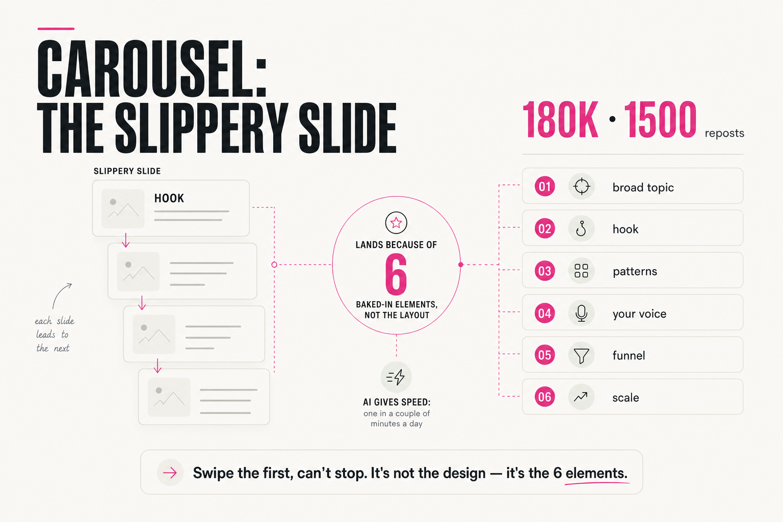
Before you open Canva: teach Claude your design style
AI carousels look generic because nobody showed the AI your style. Show Claude your examples once, and it designs like you, in HTML you can edit.
01 - The problem
Why does every AI carousel look the same?
Your AI carousel doesn't look generic because the AI has no taste. It looks generic because you never showed it yours.
Think about what you actually type. "Make a carousel about pricing mistakes, modern and clean." That's it. No colours, no fonts, no examples. So the model does the only reasonable thing: it averages. It gives you the design it has seen a thousand times, because that's the safest guess for "modern and clean."
I'm picky about design. Template generators never worked for me. And I see the same thing as with AI text: with no example to follow, AI averages.
"Make a 7-slide carousel about pricing mistakes. Modern, clean, eye-catching." → title + three bullets on every slide, a default gradient, a font nobody chose.
"Here are 5 posts whose look I love, my colours, my two fonts and how I talk. Design in this style." → slides that look like they came from your feed, not from a template.
That's why I now do one thing before I ever open Canva: I teach Claude my style once. Then every carousel starts from my look instead of from zero.
02 - Collect
What should you show Claude before it designs anything?
You don't need a brand agency for this. You need a small folder of evidence. Claude learns far more from what you show it than from adjectives like "bold" or "minimal."
Here's what goes into it:
- Posts you like. 3-5 carousels or posts (yours or anyone's) whose look you'd happily copy. Screenshots are fine. Pick for design, not for topic.
- Your colours. Exact hex codes, not "my brand pink." One background, one text colour, one accent is enough to start.
- Your fonts. One for headlines, one for body text. If you don't have fonts, pick two from your favourite examples.
- Your tone. Paste 2-3 of your own posts. Design has a voice too: loud and punchy, or calm and editorial?
- What you hate. The things you never want to see. This list is often the most useful one.
Tick them off as you go, so nothing is missing when you sit down with Claude:
- 3-5 posts or carousels whose look I love (screenshots)
- My exact colours as hex codes: background, text, accent
- One headline font and one body font
- 2-3 of my own posts, so Claude hears my tone
- A short "never do this" list (gradients, emoji as icons, stock 3D…)
03 - The brief
How do you turn your examples into a reusable style brief?
Now turn that folder into something Claude can reuse every single time: a style brief. Not a mood board. A short written set of rules it checks itself against.
You don't have to write it yourself. Let Claude do the first draft from your examples:
I'm attaching 5 designs I love, my colours and my fonts.
Study them and write my STYLE BRIEF for social carousels:
1. Background, text and accent colours (use my hex codes)
2. Headline vs body font, and how big the contrast is
3. One signature detail that repeats on every slide
4. Layout rules: margins, how much text per slide, alignment
5. Tone: how the words on the slides should sound
6. A "never do" list
Keep it under one page. Ask me about anything you can't
tell from the examples instead of guessing.
Read what comes back and correct it. If it says "playful" and you're not playful, say so. This brief is the thing that replaces "modern and clean" forever.
If you want to go further, my free guide is a 20-minute setup. Here's what's inside:
- Principles, not copies. How I pull design principles out of references instead of copying them.
- One Project that remembers. One Claude Project that remembers your fonts, your colours and your layout rules.
- No Canva. How I turn any post into a carousel without opening Canva.
- Always on brand. The instruction that keeps every output on brand.
The link to the guide is at the end of this article.
04 - First carousel
How do you get your first carousel in HTML, and fix it in two rounds?
With the brief ready, ask for the carousel. One detail matters a lot here: ask for HTML, not a picture. Claude doesn't draw pictures, but it writes code very well. An HTML carousel uses your exact colours and fonts, and you can change one word without redrawing everything.
Using my STYLE BRIEF above, design a carousel from this post:
[paste a post you've already written]
- One idea per slide, 6-8 slides, 1080×1350 each
- Slide 1 is a hook, the last slide is one clear next step
- Output: a single HTML file, each slide as its own section,
  no external libraries
- Use my real text, no placeholder copy
The first version won't be perfect. That's normal. Don't start over. Fix it in two rounds, and keep each round to one kind of problem.
ROUND 1 - structure:
"Slides 3 and 5 have too much text. Max 20 words per slide.
Make the headline on slide 1 twice as big. Every slide needs
the same margins."

ROUND 2 - style, checked against the brief:
"Now compare every slide with my STYLE BRIEF. List anything
that breaks it (colours, fonts, the signature detail, the
never-do list), then fix only those things."
Round two is the one people skip. It's also the one that catches the generic bits before your audience does. When you're happy, save the final brief and use it for every carousel after this one. That's the whole point: you teach once, and the style stays.
05 - The full method
Where do you get the full setup?
What you just read is the short version. Collect your examples, write the brief, ask for HTML, fix in two rounds. It already beats "modern and clean."
If you want the full setup, my free guide takes about 20 minutes. You teach Claude your style once, and stop explaining it every time.
☐ I showed Claude real examples, not adjectives
☐ My colours are hex codes, my fonts have names
☐ I have a written style brief I can paste again
☐ I asked for HTML, not an image
☐ I ran round 2: "check every slide against my brief"Want the full setup? Get the free 20-minute guide Teach Claude your style: join the newsletter here →
You get one email with your style setup, then one workflow every Thursday.
So tell me: what's the one thing your AI designs keep getting wrong?
Want to see how I use AI to grow an audience, build a list and launch? Join my free live workshops on 18-20 Nov, 6:00 PM Dubai time (2:00 PM London, 9:00 AM New York). One free sign-up covers all three evenings: save your free seat here →
FAQ
Why does AI-made design look generic?
Because it gets no style input. When you only write 'modern and clean', the model picks the safest average design it has seen many times. Show it real examples, exact colours and fonts, and the output starts to look like you.
Why ask Claude for HTML instead of an image?
Claude doesn't draw pictures, but it writes code very well. An HTML carousel uses your exact colours and fonts, and you can change one word or one colour without redrawing the whole slide.
Do I still need Canva?
You can still use it for finishing touches if you like. The point is to start from your own style brief, so the first draft already looks like your brand instead of a template.
What is a style brief?
A short written set of rules about your design: colours, fonts, one signature detail, layout rules, tone and a 'never do' list. You paste it into Claude every time, so you never explain your style from scratch again.