A converting landing page with AI: why awareness level decides everything
The biggest landing-page mistake is selling "buy now" to someone who doesn't yet know they have a problem. Five page types and the logic for each.

01 — The biggest mistakeWhy do most landing pages fail to sell?
A landing page usually fails not because of design or weak copy, but because of a mismatch. The biggest mistake is selling "buy now" to someone who hasn't even realized they have a problem. You shout "buy now," they're at "wait, what's the issue?" — and they leave.
A strong page starts not with the product but with what level the person who landed on it is at. Awareness level decides everything: headline, length, structure and call to action. The same product needs different pages for different people.
02 — Five typesWhat page types exist and why?
Each page has its own job and logic — and you can't mix them up:
Product/service landing → a lead; 7–12 screens; offer + proof
Registration page        → free sign-up; 1–3 screens; curiosity
Product card             → buy now; 4–6 blocks; reviews + risk removal
Lead-magnet landing       → opt-in; 1 screen; low threshold
Launch sales page (PLF)   → buy in the window; 10–15 screens; offer + deadline
Notice how length and mechanics shift: a webinar registration page is curiosity and a low threshold in 1–3 screens, while a sales page for a warmed-up audience is a full offer over 10–15 screens. The type is chosen by the job, not by "let's make it pretty."
03 — The ladderHow does awareness level change the page?
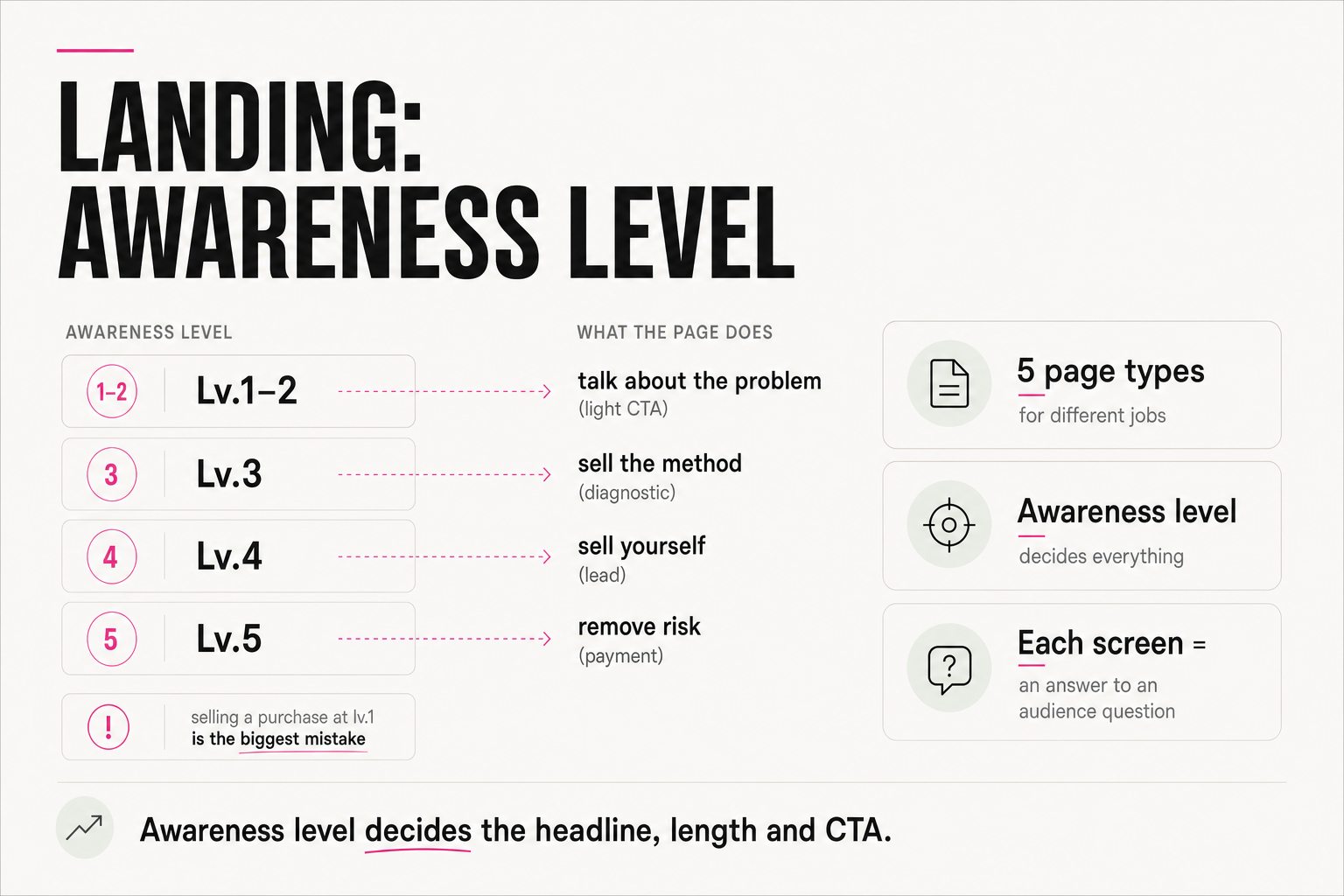
The awareness ladder has six levels: from "no problem" to "buys." And the page must speak exactly at the level the person arrived on:
- Levels 1–2 (has a problem, looking for solutions) → the page talks about the problem, not the product; a light CTA: a webinar, a guide.
- Level 3 (choosing a solution) → compares approaches and sells the method; CTA — a diagnostic or consultation.
- Level 4 (choosing a provider) → sells you: cases, credentials, differences; CTA — a lead.
- Level 5 (ready to buy) → removes the last risks: guarantees, reviews, price; CTA — payment.
Selling "buy now" to someone at level 1 is exactly that biggest mistake. Diagnose the level first, then build the page.
04 — Mind-readingHow do you know which screens are needed and which aren't?
There's a simple "mind-reading the audience" mechanic: at each stage the person has questions they ask themselves looking at the page. Each screen is an answer to 1–3 of those questions. The rule is strict:
If a screen answers none of your audience's questions — it's superfluous. Remove it.— Anjela Petkova
This instantly cuts the fluff: pretty "about us" sections and abstract values that don't move the person toward a decision. A good page is a sequence of answers to the visitor's real questions, in the order they arise.
05 — The offer coreWhat must be at the heart of the page?
The core of any selling page is the offer, and you sell not the product but the transformation. The formula: "[avatar] from [point A] to [point B] in [timeframe] — without [the main objection]." People buy not a course or a service but who they become.
So features on the page are always translated into a result: not "6 modules and 4 workshops" but "so that you can [a concrete result]." This is the part you can't hand to AI wholesale: the transformation and the real proof come from you, while AI helps assemble and phrase them.
06 — Assembling with AIHow do you assemble a landing page with AI in a couple of hours?
Once the logic is clear, AI sharply speeds up assembly: you set the page type, the audience's awareness level, the transformation offer and the proof — and it builds the structure screen by screen, each answering a visitor's question. From idea to a finished draft is a couple of hours instead of weeks.
First the diagnosis: which page type and at what awareness level. Then the transformation offer and screens as answers to questions. AI assembles it in hours, but you bring the logic and the proof. Design is secondary; matching the level comes first.
FAQ
Why doesn't my landing convert even though it looks good?
Most often because of an awareness mismatch: the page sells "buy now" to someone who hasn't realized the problem yet or is only choosing an approach. The design can be excellent. First determine what level your audience is at and speak to it — with the headline, the length and the CTA.
How do I choose the page type?
By the job and the awareness level of the incoming traffic. A cold audience at level 1–2 needs a short page about the problem with a light CTA (webinar, guide). A warmed-up one at level 4–5 needs a long page with the offer, cases and risk removal. The type sets the length, structure and call to action.
How do I tell which blocks on the page are superfluous?
Through "mind-reading the audience": each screen should answer 1–3 questions the visitor asks themselves at that stage. If a block answers none — it's superfluous. That's how you cut the abstract sections that don't move the person toward a decision.
What in a landing can I hand to AI, and what can't I?
AI is great at assembling structure for the right type and level, and phrasing headlines and screens. But the transformation offer and the real proof (cases, numbers, reviews) come from you — they can't be invented. AI speeds up assembly, but the logic and facts stay with you.