00 Start
Trends change every season. What suits you doesn't.
Eight prompts for your wardrobe, makeup and hair. You upload your own photos, and each prompt hands back a board you can look at and act on.
Most style advice stays abstract: wear this shape, avoid that color. Here you see the options on your own face and your own clothes, side by side, with a short reason next to each one.
What you'll walk away with
- A style and body type board — what your coloring and proportions support
- A wardrobe audit — every item sorted into keep, question and remove, each with its own reason
- 12 outfits from clothes you already own
- What to buy next — with a budget split and a "do not buy yet" row
- 4 makeup intensities on your own face, then a guide and an application map for the one you choose
- 6 different haircuts, each rated against your real morning time
00 Start
Before the first prompt: photos and one conversation
Everything downstream is built on the photos. Ten minutes here saves every board after it.
Two rules
- Use an assistant that generates images — ChatGPT or Gemini. The boards are pictures, not text
- Keep all eight prompts in one conversation. Each one uses what the last one found, so by the fourth it already knows your wardrobe. You don't need to upload the same photos twice
01 Your style
Four lines about you
The prompts work from what you state, not from guesses about your appearance.
01 Your style
Prompt 1 — Your Style & Body Type Analysis
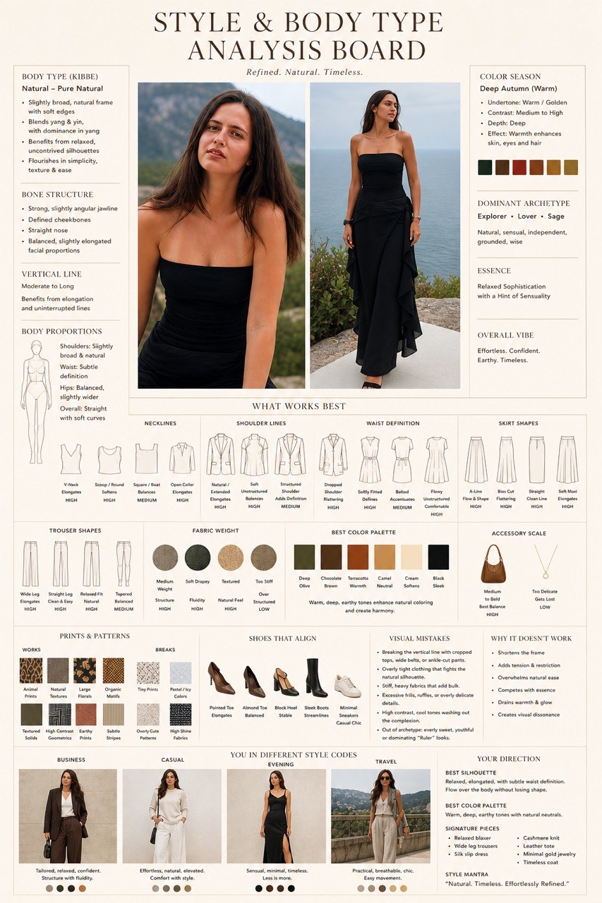
The setup board. It reads your proportions and coloring and turns them into silhouettes, a palette and a direction.
Create a high-end editorial “Style & Body Type Analysis Board” using this portrait and full-body photo. Luxury fashion magazine style — Dior / Ralph Lauren / The Row aesthetic, clean beige/ivory background, warm editorial atmosphere, soft diffused lighting, ultra-detailed photorealistic quality, minimal elegant typography, airy grid layout.
My details:
— Height: [add here].
— Usual clothing size: [add here].
— Lifestyle and occasions I dress for: [add here].
— Styles I like: [add here].
— Include an optional Kibbe interpretation.
Center the natural portrait and full-body shot: no retouching, real skin, same face, same proportions. Keep the original skin and clothing colors neutral and faithful, even within the warm editorial design.
Add analysis: visible body proportions, shoulder/waist/hip relationships, vertical line, and color season direction — undertone and contrast level. If requested, include a tentative Kibbe classification and subtype; do not force a definitive label when the photos are insufficient.
Suggest a dominant style direction based on my stated preferences, such as romantic, relaxed, classic, dramatic, or minimalist. Do not infer personality from my appearance.
Show silhouettes that work:
— Necklines: V / round / square / boat.
— Shoulder lines: sharp / soft / extended.
— Waist definition: fitted / loose / draped.
— Skirt and trouser shapes: straight / A-line / wide / cropped / full-length.
— Fabric weight: structured versus flowing.
For each selected option, show clear construction, a short note explaining the effect — elongates / balances / softens / adds volume — and a harmony level relative to my stated style goals: high / medium / low.
Then show:
— Best starting color palette: 4–6 swatches with their apparent effect near my face.
— Prints and patterns that support or change the overall effect.
— Accessory scale: delicate / medium / bold.
— Shoe shapes and how they connect with the outfit’s lines.
Add visual styling pitfalls — proportion breaks, fabric weight, or conflicting styling choices — and explain why they may work against the intended effect. Do not describe my body as a problem or assume I want to look thinner.
Final: “You in Different Style Codes” — capsule looks for relevant occasions such as business / casual / evening / travel — plus a clear direction: strongest silhouettes, color palette, and signature pieces.
Provide a concise written breakdown alongside the visual board. Treat photo-based color and body-type interpretations as provisional. Keep the board visual-first with short, readable labels; split it into coordinated images if needed.
Work from the details provided. Ask for a replacement photo only if the original cannot support a useful assessment. If image generation is unavailable, say so instead of claiming to have created the board.
02 Wardrobe
Your wardrobe, in a few lines
Three prompts use these answers: the audit, the outfits and the shopping plan.
02 Wardrobe
Prompt 2 — Your Wardrobe Audit
Every item gets an ID and a verdict: keep, question or remove, each with a one-line reason.
Create a visual “Wardrobe Audit Board” using photos of my wardrobe and this portrait. Luxury editorial style — The Row / Toteme aesthetic, ivory background, photorealistic, minimal typography, airy grid layout.
My details:
— Season and climate: [add here].
— Lifestyle and dress code: [add here].
— Items I wear most: [optional].
— Items I rarely wear or feel unsure about: [optional].
Use the style and color analysis already available in this conversation. If there is none, base the review on my stated preferences and the visible items rather than inventing a personal type.
Assign each garment a simple ID so I can identify it.
For each garment give a verdict: KEEP / QUESTION / REMOVE — with a color tag. Show the item, a small styling visualization where useful, and a one-line reason tied to my preferences, proportions, palette, or lifestyle rather than generic fashion advice.
Interpret the categories as:
— KEEP: a useful piece to wear and build around.
— QUESTION: try a different combination, check the fit, or consider alteration.
— REMOVE: a candidate to let go, only when there is a clear practical reason. The final decision is mine.
Do not recommend removing a piece solely because it falls outside a color season or body-type category. Do not invent its condition, comfort, fabric composition, or actual fit.
Highlight HERO PIECES — items that work especially well — in a separate row with a gold accent.
Identify any supported pattern in what I keep over-buying or underusing. Summarize it in one sentence. If the uploaded selection is too small to establish a pattern, say so.
Add three promising combinations using my existing pieces.
Keep the garments recognizable and faithful to the uploads. Do not redesign them or change my body proportions. Any on-body render is an approximate styling illustration, not a reliable fit prediction.
Provide a short written review with item IDs alongside the board. Keep image labels brief and readable; use separate boards for larger batches. If image generation is unavailable, say so and provide the written review.
02 Wardrobe
Prompt 3 — Your Outfits, Styled
12 complete outfits from clothes you already own, before you spend anything.
Create a high-end editorial “Styled From Your Wardrobe” lookbook using my uploaded clothes and reference photos. Luxury fashion magazine style — The Row / Ralph Lauren / Toteme aesthetic, ivory background, soft diffused lighting, photorealistic detail, minimal elegant typography, airy composition.
My details:
— Season and weather: [add here].
— Occasions: [work / weekends / evenings / travel / other].
— Style mood: [add here].
— Comfort requirements or things I do not want to wear: [optional].
Create 12 complete outfits using only the items I uploaded. If there are not enough distinct combinations, make fewer rather than repeating looks. Use any previous style analysis and wardrobe audit as flexible guidance, while prioritizing my preferences and everyday life.
For each outfit:
— Give it a short editorial title.
— Identify the occasion.
— List the exact pieces using item IDs or clear descriptions.
— Explain briefly why the proportions, colors, and textures work together.
— Add one styling detail: tuck, cuff, layering, belt placement, or accessory choice.
Include shoes and bags where available. Do not quietly introduce pieces I do not own. If an essential item is missing, identify it separately and offer the closest workable version first.
Visual: create a coordinated lookbook with twelve numbered looks, using faithful flat lays or realistic styling visualizations. Preserve the actual colors, shapes, and details of my garments. If showing me wearing the outfits, preserve my face and body proportions.
Keep the images visual-first with short labels. Split into two boards if this improves readability. Label on-body images as approximate styling previews.
Finish with three reusable outfit formulas based on my own wardrobe.
Explore more combinations in text
Look through my uploaded wardrobe again and create 12 additional outfit combinations as a numbered text list, without generating an image. Avoid repeating previous looks. Use only items I own, and make fewer outfits if there aren’t enough distinct combinations.
Visualize your favorites
Create an editorial outfit board showing looks [insert numbers] from your last list. Keep the same visual style and show no more than three outfits per image.
02 Wardrobe
Prompt 4 — What to Buy Next
Up to five additions, each with two outfits from your own pieces, a priority and a share of your budget. Plus a "do not buy yet" row.
Create a visual “Wardrobe Gap Analysis Board” using photos of my wardrobe and this portrait. Luxury editorial style — The Row / Toteme aesthetic, ivory background, photorealistic, minimal typography, grid layout.
My details:
— Season and climate: [add here].
— Lifestyle and occasions to cover: [add here].
— Total budget and currency: [add here].
— Any specific wardrobe frustration: [optional].
Map what I already have: silhouettes, palette, style codes, and occasions covered.
Then find the GAPS based on my preferences, lifestyle, and any previous color or proportion analysis. Use an optional Kibbe interpretation only as supporting guidance, not as a shopping rule.
Check whether restyling or alteration can solve a need before suggesting a purchase.
Recommend up to five additions. For each missing item show:
— A photorealistic illustrative render: specific silhouette, fabric qualities, and color.
— The gap it fills.
— Two outfits with items I already own, using item IDs.
— Priority: ESSENTIAL / STRONG ADD / NICE TO HAVE.
— Price tier: investment / mid / mass-market.
— A suggested budget allocation within my stated total.
If two combinations are not supported by my uploaded wardrobe, say so rather than inventing owned items.
Add a “Do Not Buy Yet” row: up to four items that would duplicate what I have or contribute little to my stated goals.
Final: before / after — which everyday situations my current wardrobe covers and which the proposed additions would cover.
Visual-first, short labels, no paragraphs on the board. Provide the reasoning in a concise written breakdown alongside it.
Clearly label generated products as shopping references, not actual listings. Do not invent brands, prices, links, or availability. If image generation is unavailable, say so and provide the written plan.
03 Makeup
Prompt 5 — Compare Your Makeup Options
Four makeup intensities on your own face, from bare to full, so you choose by looking instead of imagining.
Create one high-end editorial “Makeup Comparison Board” using my original portrait. Luxury beauty magazine aesthetic, ivory background, fine dividing lines, minimal elegant typography, photorealistic details, and a clean comparison grid.
My details:
— Occasion: [choose one: everyday / work / evening / special event].
— Preferred style: [add here, or write “open to suggestions”].
— Time available for makeup: [add here].
If no occasion is specified, use everyday. Do not print unfilled bracket instructions or a list of unselected options on the board.
Help me compare makeup options on my own face before choosing a look.
Keep the same face, expression, camera angle, crop, lighting, exposure, hairstyle, and skin tone throughout. Change only the makeup. Preserve my facial proportions, age, and natural skin texture.
Create these sections on one board:
YOUR NATURAL FEATURES
A small original reference portrait with up to four short annotations about visible features relevant to makeup, such as brow shape, eye shape, lips, and facial proportions.
MAKEUP INTENSITY — MAIN COMPARISON
Four equally sized portraits side by side:
— No makeup — original reference.
— Light / natural — sheer coverage, subtle eye definition, softly tinted lips.
— Medium / defined — visible eyeshadow depth, defined lash line, blush, and more deliberate lip color.
— Full glam — stronger eyeshadow contrast, pronounced liner and lashes, more sculpted cheeks, and a richer lip.
Make the four levels visibly distinct at a glance. Do not make every option a subtle variation of natural makeup. Preserve my identity and facial anatomy rather than reshaping features to create drama.
Give each version one short effect label. Highlight the option that best matches my preferences, occasion, and available time. Do not automatically choose medium makeup or describe my bare face as inadequate.
BROW DEFINITION
Three matching close-ups: soft / naturally defined / bold.
Show the complete eyebrow. Vary brow makeup only, keeping eye makeup and lashes unchanged. Do not alter my underlying brow anatomy.
EYE DEFINITION
Three matching close-ups: light definition / soft smoky / strong definition.
Frame the eyelid and lash line. Show clear differences in shadow intensity and lash-line definition while keeping brow makeup unchanged.
LIP INTENSITY
Three matching close-ups: soft / medium / deep.
Show the complete lips and surrounding skin. Preserve my lip shape and use a consistent color family so the main comparison is intensity.
YOUR RECOMMENDED BALANCE
A short summary of the recommended makeup intensity, brows, eyes, and lips, with small color swatches. Base the recommendation on my preferences rather than a universal beauty rule.
Make comparisons the main visual content. Every close-up must demonstrate the feature named in its heading. Within each comparison, change only the named makeup element.
Keep all headings, faces, swatches, and labels fully inside the canvas with generous outer margins. Use no more than one short sentence per panel. Shorten the text rather than shrinking it. Do not crop edge columns.
No paragraphs, product displays, application diagrams, or extra pages.
Treat the edited portraits as approximate makeup previews. Do not invent undertone tests or make definitive color claims from uncertain lighting.
Generate this single comparison board.
Optional follow-up
Explain the makeup comparisons in a separate text message. Describe the effect of each option and why you recommended that combination. Do not generate another image.
03 Makeup
Prompt 6 — Your Personal Makeup Guide
One board for the look you chose: palette, breakdown by zone, eye and lip details.
Create one high-end editorial “Personal Makeup Guide” for the look I selected from the previous comparison board.
My selected look: [light / natural, medium / defined, full glam, or describe your choice].
Products or finishes I want to use or avoid: [optional].
Use my original bare-face photo as the reference for my features and the selected version as the makeup direction.
Luxury beauty magazine style: clean ivory background, soft diffused lighting, refined typography, photorealistic close-ups, delicate rules, and an airy grid layout.
Create these sections on one board:
YOUR CHOSEN LOOK
One main portrait showing the finished makeup. Preserve my face, age, facial proportions, skin tone, and natural skin texture. Change makeup only.
Match the selected intensity: if I chose medium or full glam, make that level of makeup clearly visible rather than defaulting to a barely-there look.
Add three short labels describing the look’s defining choices.
YOUR MAKEUP PALETTE
Clearly named color-family swatches for:
— Eyes.
— Blush.
— Lips.
— Optional bronzer or contour, if relevant.
Use any previous color analysis as guidance. Do not claim an exact foundation or concealer shade match from a photo.
THE LOOK BREAKDOWN
Six compact entries, each with a relevant close-up and one short practical recommendation:
— Base: cheek and nose area showing coverage and skin finish.
— Brows: the complete eyebrow showing shape and definition.
— Eyes: eyelid and lash line showing shades and definition.
— Cheeks: enough of the cheek to show blush placement.
— Sculpting / glow: cheekbone and temple, only if part of the selected look.
— Lips: the complete lips showing color and finish.
Every close-up must demonstrate its heading. Do not reuse an eye crop for base, blush, or sculpting sections.
EYE DETAILS
Two close-ups showing subtle variations within the selected look, such as softer shadow versus added lash-line definition. Keep both consistent with the chosen makeup intensity.
Change only the eye makeup between these comparisons.
LIP FINISH
Three close-ups comparing sheer tint / satin lipstick / gloss in a similar color family. Preserve my natural lip shape and keep the lighting identical so the finish is visible.
WHAT MAKES THIS LOOK WORK
Three concise, personalized styling principles, such as balancing eye and lip intensity or coordinating blush and lip colors.
Focus on the finished look, shades, and product textures. Do not repeat the full intensity comparison or include step-by-step application maps.
Keep all headings, portraits, swatches, and labels fully inside the canvas with generous outer margins. Use no more than one short sentence per panel. Shorten the text rather than shrinking it. Do not crop edge columns or add text to fill space.
No paragraphs, decorative product packaging, or extra pages. Identify the portrait as an approximate makeup preview.
Generate this single personal makeup board.
Optional follow-up
Turn this board into a practical text guide. List the product types, color families, and finishes for my chosen look. Do not generate another image.
03 Makeup
Prompt 7 — How to Apply Your Makeup
A placement map on your own face: where each product goes and in what order.
Create one detailed editorial “Makeup Application Map” showing how to recreate my selected makeup look.
My details:
— Skill level: [beginner / intermediate / experienced].
— Time available: [add here].
— Products and tools I already own: [optional].
Use my original bare-face photo for facial anatomy and the selected makeup image as the target result.
Luxury beauty education style: ivory background, muted rose-brown section headers, fine dividing lines, photorealistic close-ups, translucent placement overlays, clear arrows, and readable numbered labels.
Create these sections on one board:
TARGET RESULT
A small portrait of the selected finished look.
MAIN FACE MAP
One large portrait with clearly marked placement zones for the products used in this look:
— Blush.
— Contour or bronzer, if relevant.
— Highlight, if relevant.
— Concealer, where relevant.
Use distinct overlay colors, a simple legend, and blending arrows. Adapt placement to my features and the selected effect.
Distinguish contour from bronzer and concealer from luminous highlighter. Do not apply a generic correction template or add unnecessary steps.
FACE — APPLICATION ORDER
Up to five numbered mini-panels showing the relevant face-product sequence. Each panel gets one short instruction naming placement and blending direction.
Frame each panel around the area being demonstrated rather than repeatedly using the same eye crop.
EYES — STEP BY STEP
Five numbered close-ups progressing toward the selected eye look:
— Base.
— Initial definition.
— Depth and blending.
— Lash-line definition.
— Lashes and finish.
Adapt the steps to the chosen look. Use shaded zones and arrows to show exactly where each product goes. Include an eyes-open view so placement can be understood on my eye shape.
BROWS & LIPS
Two brow close-ups: fill / set. Show the complete eyebrow.
Two lip close-ups: define / finish. Show the complete lips.
Show only the techniques needed for the selected result. Preserve my natural brow and lip anatomy.
TOOLS & SHADES
A compact row showing the essential tools and color families used. Do not invent brands or exact product shade matches.
Keep my face, age, proportions, and skin tone consistent throughout. Make the placement overlays clearly distinguishable from blended makeup.
Prioritize diagrams and close-ups. Keep every panel fully inside the canvas with generous margins. Use one short instruction per panel, no long paragraphs, no additional look comparisons, and no extra pages. Shorten labels rather than shrinking them.
Generate this single application board.
Optional follow-up
Write a step-by-step tutorial matching this application map. For each step, explain the product, starting amount, tool, placement, and blending direction. Keep it suitable for my skill level and available time. Do not generate another image.
04 Hair
Prompt 8 — Your Hair Edit
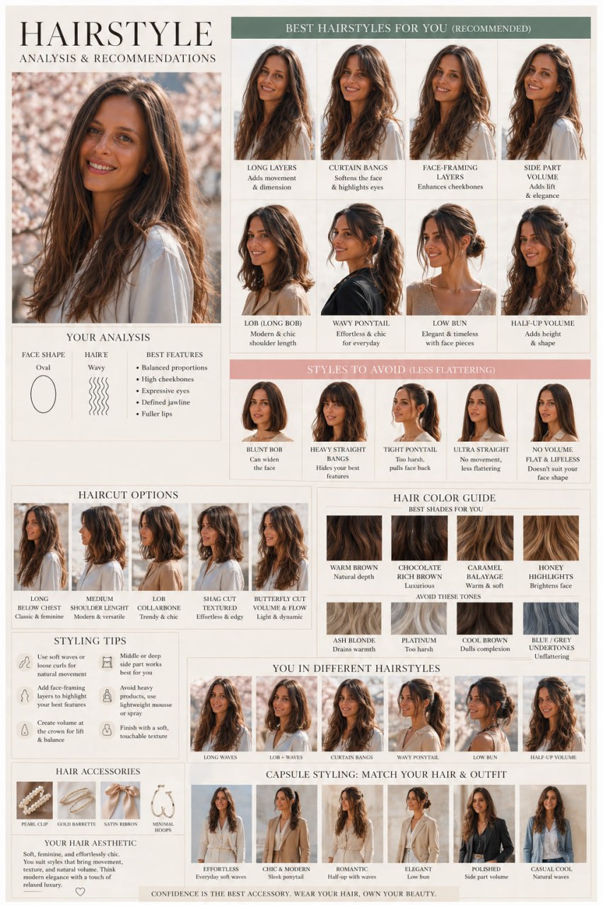
Six clearly different haircuts on you, four ways to style the best one, three color directions — each rated against your morning.
Create a high-end editorial “Hair Structure & Styling Board” using my natural portrait. Luxury beauty magazine style, ivory background, soft diffused lighting, photorealistic quality, minimal elegant typography, and a structured, airy comparison grid.
My details:
— Natural texture: [straight / wavy / curly / coily].
— Daily styling time: [add here].
— Length or changes I want to avoid: [optional].
— Current coloring or chemical treatments: [optional].
Make this a visual comparison of clearly different haircuts, styling options, and colors, with short explanations of what each option does and how well it fits my routine.
Use my original portrait as the reference throughout. Preserve my face, age, skin tone, facial proportions, and natural skin texture. Keep the angle, expression, and lighting consistent across comparisons. Change only the hair.
1. YOUR FEATURES & HAIR STRUCTURE
Include a small natural reference portrait.
Briefly describe visible face proportions, facial structure, and hair texture, movement, and apparent density. Distinguish what is visible from what cannot be established from the photos.
Identify where adding volume, reducing bulk, or introducing movement would create different effects. Do not treat natural asymmetry as a flaw.
2. HAIRCUT COMPARISON — SIX DISTINCT OPTIONS
Show six clearly different haircut options on me in a two-row grid.
Select relevant constructions from:
— Blunt, solid perimeter.
— U-shaped or V-shaped perimeter.
— Long or medium layers.
— Face-framing layers.
— Bob or lob.
— Shag or a more textured cut.
— Bangs versus no bangs.
— Different lengths.
Do not make all six options minor variations of the same haircut. Include a conservative option close to my current hair and more noticeable alternatives, respecting any stated limits.
Hold hair color and styling finish consistent in this section so the cut differences are easy to compare.
For each option, include:
— Cut name.
— Construction: length, perimeter, layers, and fringe.
— One short effect label: elongates / widens / softens / adds movement / adds weight.
— Fit for my preferences and daily styling time: HIGH / MEDIUM / LOW.
— One brief reason for that rating.
Use ratings to explain practical and visual trade-offs, not to declare an option universally good or bad.
Where a U/V perimeter or layering pattern cannot be seen from the front, include a tiny back-view diagram labeled “cut structure.”
3. STYLING COMPARISON — FOUR OPTIONS
Using one recommended haircut, show four distinct styling options selected from:
— Sleek and straight.
— Soft waves.
— Voluminous blowout.
— Bun or ponytail.
Choose styles compatible with the illustrated length. Keep the haircut and color the same across these comparisons.
For each, show:
— How the styling supports or changes the cut.
— The effect of volume, movement, parting, and finish.
— Approximate styling time and essential tool.
Do not present a salon blowout as effortless everyday styling. Flag options likely to exceed my daily styling time.
4. COLOR COMPARISON — THREE DIRECTIONS
Show the same recommended cut in:
— My current color.
— One subtle alternative.
— One more noticeable alternative.
Choose warm, neutral, or cool directions based on the reference and available information rather than automatically favoring warmth.
For each, add a short note about contrast, visible dimension, and maintenance. Treat color previews as approximate. Do not promise that a color is achievable without knowing my treatment history.
5. DETAILS THAT CHANGE THE RESULT
Add three small visual callouts showing relevant effects, such as:
— A heavy perimeter versus lighter ends.
— Flat roots versus controlled lift.
— Dense face-framing versus softer separation.
Explain each effect in a few words and connect it to the intended result. Avoid presenting these as flaws in my natural hair.
6. YOU IN DIFFERENT LOOKS
Finish with three compact capsule looks combining the strongest options:
— Everyday.
— Polished.
— Statement.
Name the haircut, styling, and color used in each. Highlight one recommended starting direction and explain briefly why it fits my routine.
Keep the board visual-first. Give the haircut comparison the most space. Use short labels rather than paragraphs, readable typography, and generous outer margins. Keep every portrait and caption fully inside the canvas.
Do not silently add density, extensions, or unrealistic volume. Label the visualizations as approximate previews.
Optional follow-up
Turn my chosen option [insert number] into a short salon brief. Describe the length, perimeter, layers, face framing, styling routine, and optional color. Include what the stylist should assess in person. Respond in text only.
05 Final
Done. Eight boards, all built on you
What you did
Read your proportions and coloring, audited the wardrobe, built outfits from what you own, planned what to buy, compared makeup on your own face and chose a haircut by looking at it.
Before you act on it
- The portraits are approximate previews. Treat color and fit as a direction, and check them in a mirror and in a fitting room
- Take the salon brief from prompt 8 to your hairdresser. They assess in person what a photo can't show
- Run the audit again when the season changes. The same conversation still knows your wardrobe
I show workflows like this in the channel first
Get the next ones before anyone else
Real AI workflows from my own work and my focus groups, tested before I share them.
Subscribe on WhatsApp →Your answers are saved in this browser. Next time the prompts open already filled in.
Method and guide: Anjela Petkova, from focus-group practice